Thursday, March 8, 2012

Blog 8


The Hurt Locker – Ending


I believe that the main theme of the film, The Hurt Locker, is that you can’t run from your purpose in life. This theme is demonstrated actively by the main character, William James, throughout the movie, but in the final scene the theme is finally revealed didactically when he talks about how you don’t know what you’ve got till its gone, as well as how he loved being a soldier and disarming bombs. He then talks about how that was his real purpose in life, before he returns to war.

            Throughout the film, The Hurt Locker, the theme of, not being able to run from your purpose in life, is referenced actively. This is done by showing William James’ complete disregard for his own life while doing his job, of disarming bombs, because he just loves doing it so much that he doesn’t care about anything else. In the final scene, where he is playing with and talking to his infant son, the theme is finally demonstrated didactically for the first time when he says, “You know what, buddy? Once you get older, some of the things that you love might not seem so special anymore.” One of more interesting parts of this scene is Will’s relationship with his son. During his conversation with his infant son, he reveals the objective fact that he does love being in the military and disarming bombs, but the fact that he actually loves his son, is subjective. During this scene the space seems to be limited so it feels claustrophobic and uncomfortable, like he is contained or trapped. This plays into the theme because he feels out of place as a civilian, like he needs to leave and go back to war. This use of space is again demonstrated when he returns to war and the camera is in a wide shot giving the frame a sense of space to breath and freedom, just like Will is feeling because he is back where he belongs. The shots of Will are also surrounded by a lot of sharp, straight lines, which contrast with the curvy lines on and around his son, during his shot. This contrast in shape and line further pushes the idea that he is rigid and tense because he uncomfortable and out of place.

Blog 7


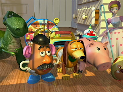
Both of these pictures are from the amazing animated movie series, Toy Story. The first picture is from a scene in the first movie, where the toys are given the bad news that there is going to be new toys coming that might replace them. The second picture is from the scene in the third movie, where they are first introduced to their new wonderful home.

Color
            In both of the different pictures of animation, the colors that are used for the different characters, objects, and backgrounds, are all very oversaturated so that they will look more vibrant and interesting, especially to children who are the primary viewers of the series. Each character has a specific color, or set of colors, to help stand out and differentiate them from the other characters. Each character also has all different shades of their colors to help show their textures. Woody has a big head that is made up of bright skin tones, so that he stands out as an important character. His other main colors are in his dark brown hat, his yellow shirt, blue jeans, and other brown accessories, which are all slightly less bright than his face. They are less bright than his face because his face is his most important feature that needs the most attention, but all those colors are still brighter than other characters because he is the most important character. Buzz shares the Woody pattern of having brighter colors than everybody else, with his bright white and green suite, because he is also the other most important character. Though in the second picture, your eyes are drawn to Lots-O because he is the focus of the shot by him having saturated and bright pinks and whites.

Lighting
            Both of these shots have very dynamic lighting because of their extreme use of shadows. In the first shot there are a lot of very dark and prevalent shadows that cover different parts of characters bodies as well as the background. This gives the scene a darker, gloomier, and slightly more depressing mood because of the shard contrasts of light and dark. It is also symbolic for how the characters feel because they are feeling sad and depressed on account of possibly being replaced or played with less. It is also symbolic of how the characters feel like they are being overshadowed by the new toys. The second picture has a lot of extra light coming into frame, which creates less dark shadows. This makes the mood more happy and welcoming. This is symbolic of how the characters are getting a new bright beacon of happiness.

Blog 6

180 Degree Rule

            This video definitely seemed to follow the 180 degree rule the whole time. This is because there are basically only two distinct different shots throughout the whole video. The first shot is inside the building looking at Arthur and Eames and shows when they fire their guns at the enemies out of the door. The second shot is outside showing the enemies being shot at. The two cameras are very much within the 180 degree arc because they are a few feet from each other and facing the same way with a mere 30 degrees of difference.

Rule Of Thirds

            The video seems to adhere the rule of thirds throughout most of its shots. This is because during the single shots with just Arthur in the frame, he is in the first, top left, intersection of thirds pretty much the whole time. When Eames joins him in the double shots, he takes the top left intersection of thirds while Arthur moves over to the second, top right, point. During the frames where you are able to see the enemy firing at them, the enemy seems to stay around the top left intersection. But in the enemy’s second shot, he is more of in the middle of the frame, not leaving any major action at any of the intersections.

30 Rule

            This video adhered to the 30 rule through the entirety of the clip, either changing 30 degrees or 30 percent, between each shot. This video actually moved 30 degrees and percent between each of the two back and forth shots. When you are inside the building you see a medium shot of Arthur and Eames. That medium shot inside the building is 30 degrees away from the other shot outside. The exterior shot is a wide shot showing some buildings and the enemy off in the distance on a roof.

Blog 5


Beat It - Michael Jackson - 1982

Beat It - Fall Out Boy – 2008


Michael Jackson - LISTENING FRAMEWORK

LISTENING PHASE 1 (Rhythm)
Tempo
- Medium
Source
- Guitar/Bass and Drums
Groove
- Pop, with a little Rock
LISTENING PHASE 2 (Arrangement)
Instrumentation
- Vocals, drums, guitar, bass, synth, lead/solo guitar
Structure/Organization
- Intro, Verse, Verse, Chorus, Verse, Verse, Chorus, Chorus, Gtr. solo, Chorus, Chorus
Emotional Architecture
- The song builds up to the choruses and the guitar solo, but drops when returning to the verses.
LISTENING PHASE 3 (Sound Quality) Balance
Height
- Voice and Guitar are high, Bass and Synth are low
Width
- Drums and synth are in the middle, Bass and the guitar solo are on the left, Guitar is on the right, and the vocals pan back and forth
Depth
- Vocals and the guitar solo are the loudest, and the bass/guitar are also kind of loud

Fall Out Boy - LISTENING FRAMEWORK

LISTENING PHASE 1 (Rhythm)
Tempo
- Fast
Source
- Drums and Guitar/Bass
Groove
- Punk. With some Pop and Rock
LISTENING PHASE 2 (Arrangement)
Instrumentation
- Vocals, lead guitar, drums, guitar, bass
Structure/Organization
- Intro, Verse, Verse, Chorus, Verse, Verse, Chorus, Chorus, Gtr. solo, Chorus, Chorus
Emotional Architecture
- The song builds up to the choruses and the guitar solo, and then drops when returning to the verses.
LISTENING PHASE 3 (Sound Quality) Balance
Height
- Guitar is high, Bass and Drums are low
Width
- Guitar is on the left, the Guitar solo is on the right, and vocals pan back and forth
Depth
- Vocals, Lead Guitar, and the Guitar solo are the loudest

For my comparison I chose to compare the original version of Michael Jackson’s 1982 pop hit, Beat It, with Fall Out Boy’s 2008 cover of the song, that took a more punk approach to the hit. The original version of the song is more of a medium tempo pop song with some rock groove to it. The cover is a much faster rendition of the song that focuses its groove on being a very punk song that has many elements of the pop and rock genre’s. The cover made by a four-person punk/rock band, rather than the original that was sung by one guy and used mostly synth sounds and instruments, to create the rhythm. Both songs featured special guest musicians for their respective guitar solos. The original featured Eddie Van Halen, while the cover featured John Mayer doing its guitar solo. Both the cover and the original shared the same structure and emotional architecture, as well as the source of their sound and mostly had the same instrumentation. The two songs tended to differentiate on their height, but shared a similar depth, with the vocals and guitars being the loudest instruments in each song. Each song did have their own different and distinct width, besides them both having the vocals pan back and forth throughout the song. The cover had most of the instruments and vocals panned evenly through both sides, but has the regular guitar panned to the left, while the guitar solo is panned to the right. The original has the guitar panned to the right and has the bass and guitar solo panned to the left, while the drums and the synth are panned evenly in the middle.

I prefer the Fall Out Boy version of the song better because it has more of a rocking punk groove to it and has more traditional rock instruments, rather than synth and sampled instruments. I also liked the faster tempo that made the song more intense an interesting. Overall I like traditional rock and punk music more than “just pop” songs that Michael Jackson has produced, though I am fond of them as well.